Branding projects
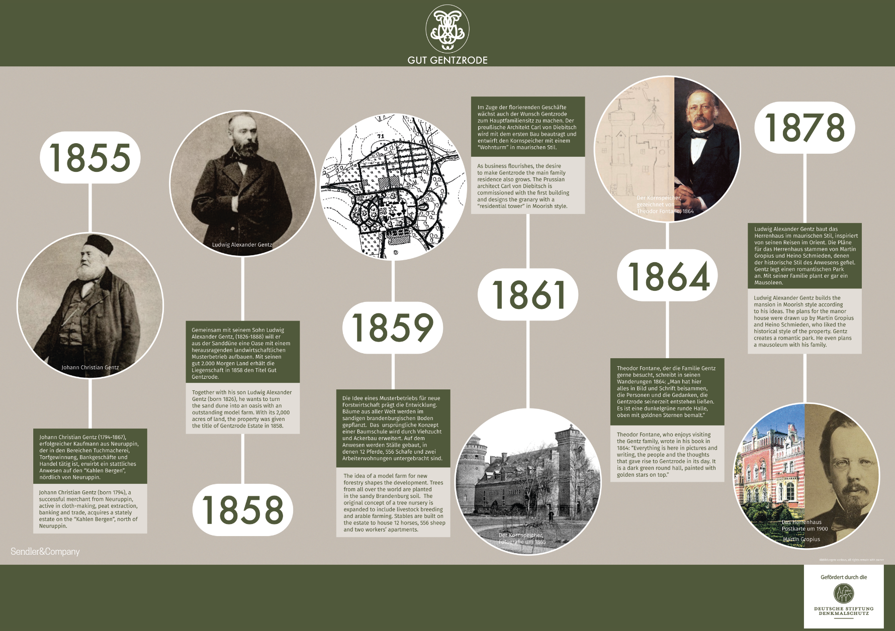
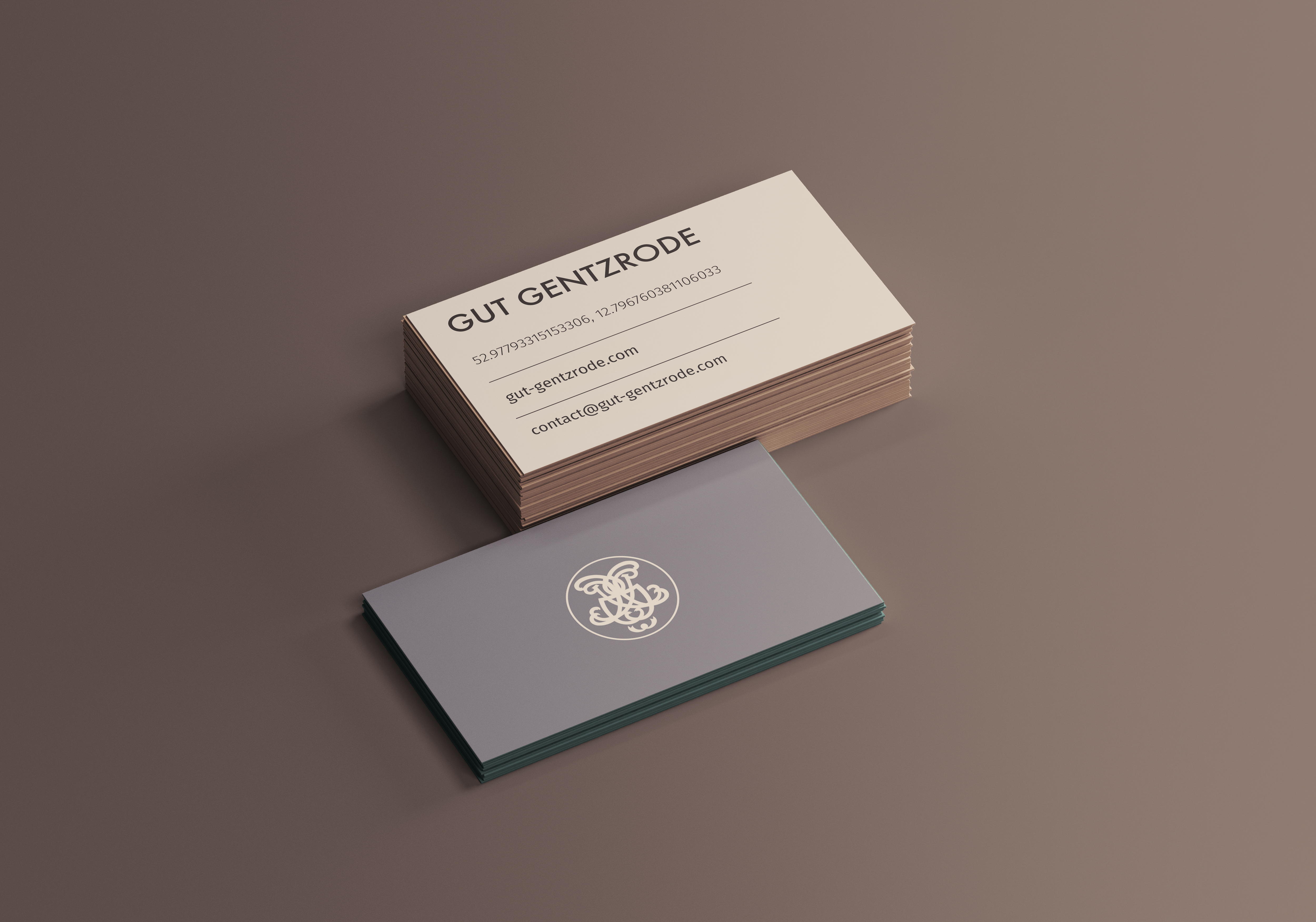
Gut Gentzrode
Brandenburg - Architectural site : 2024


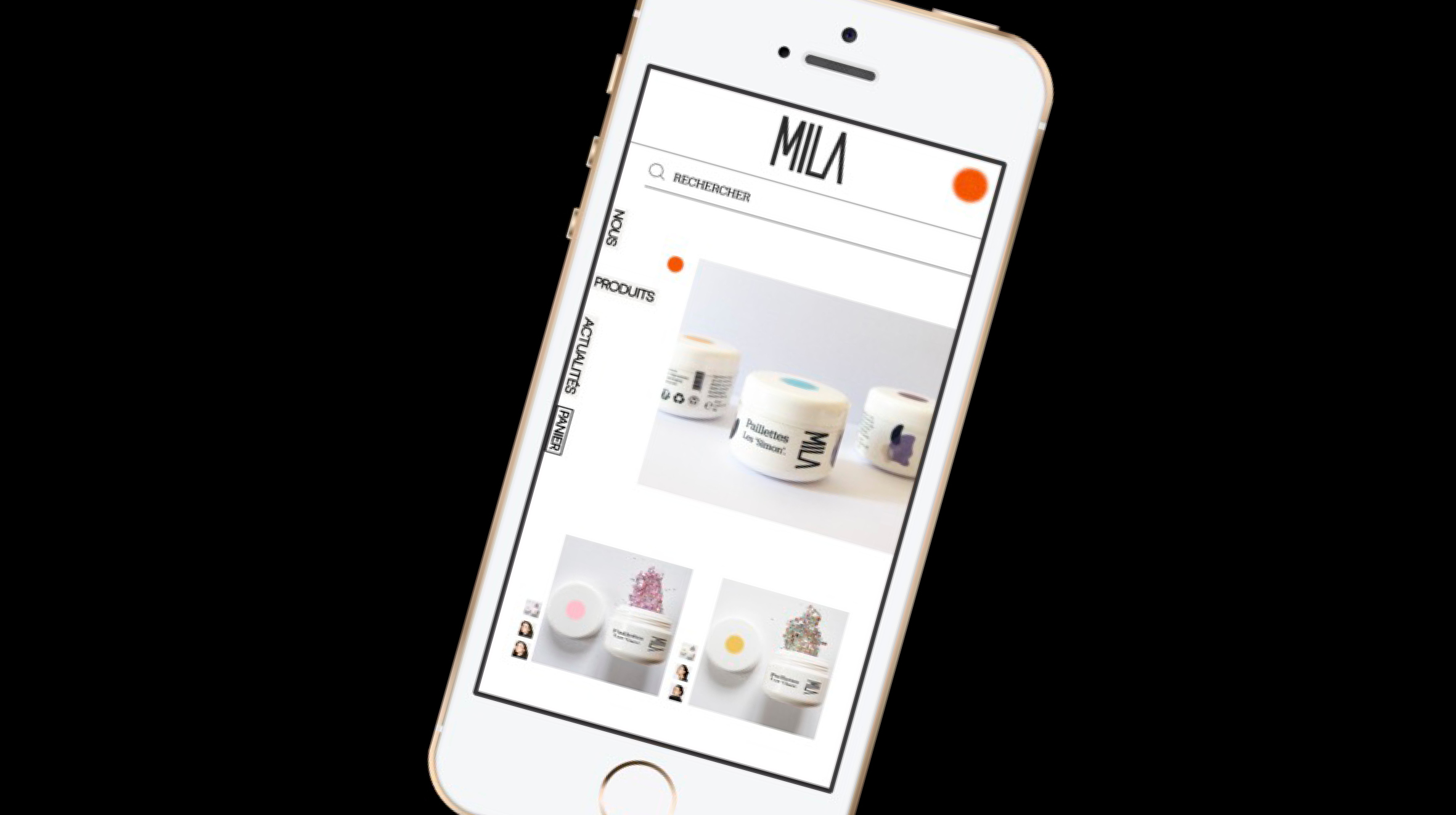
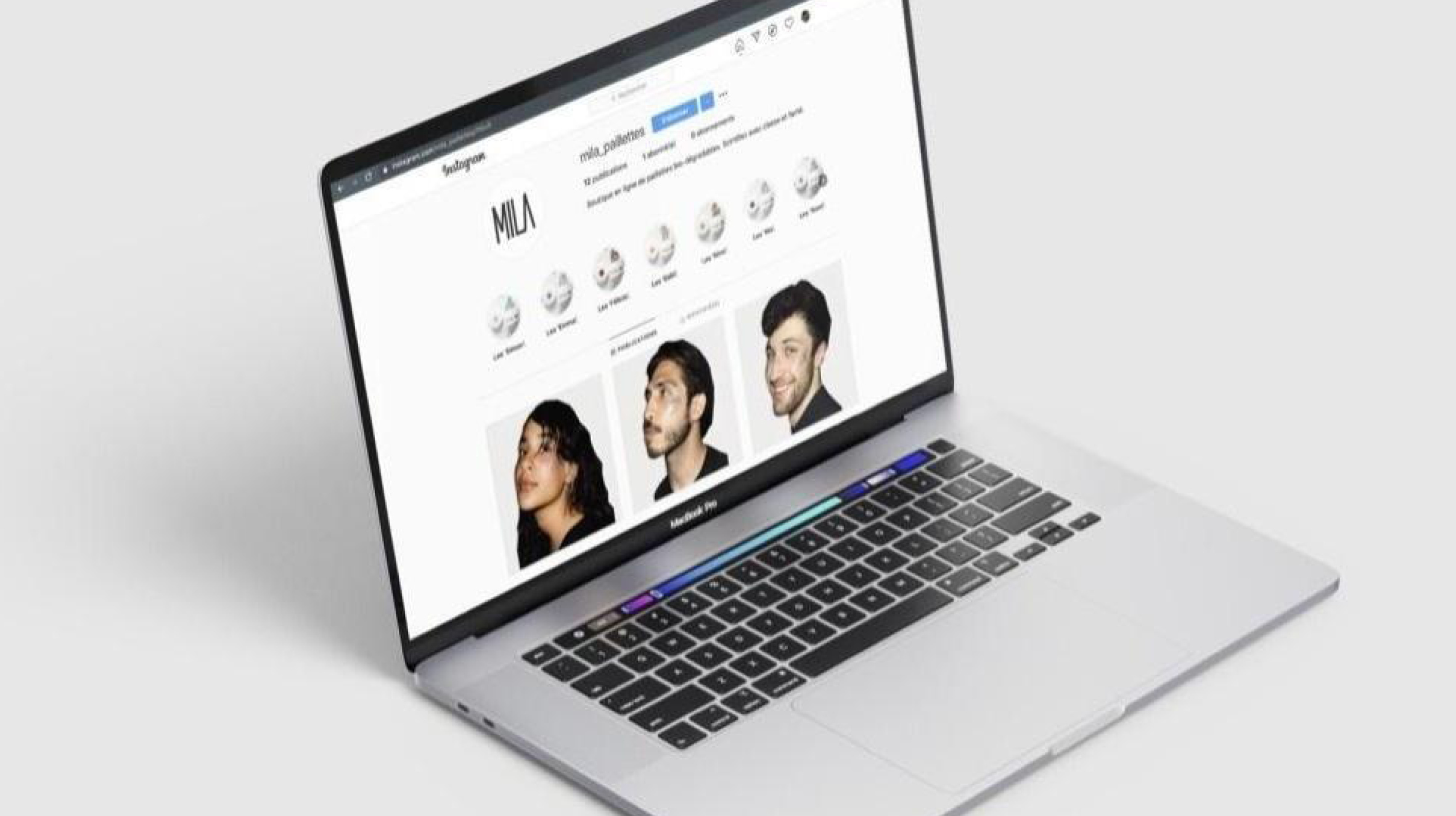
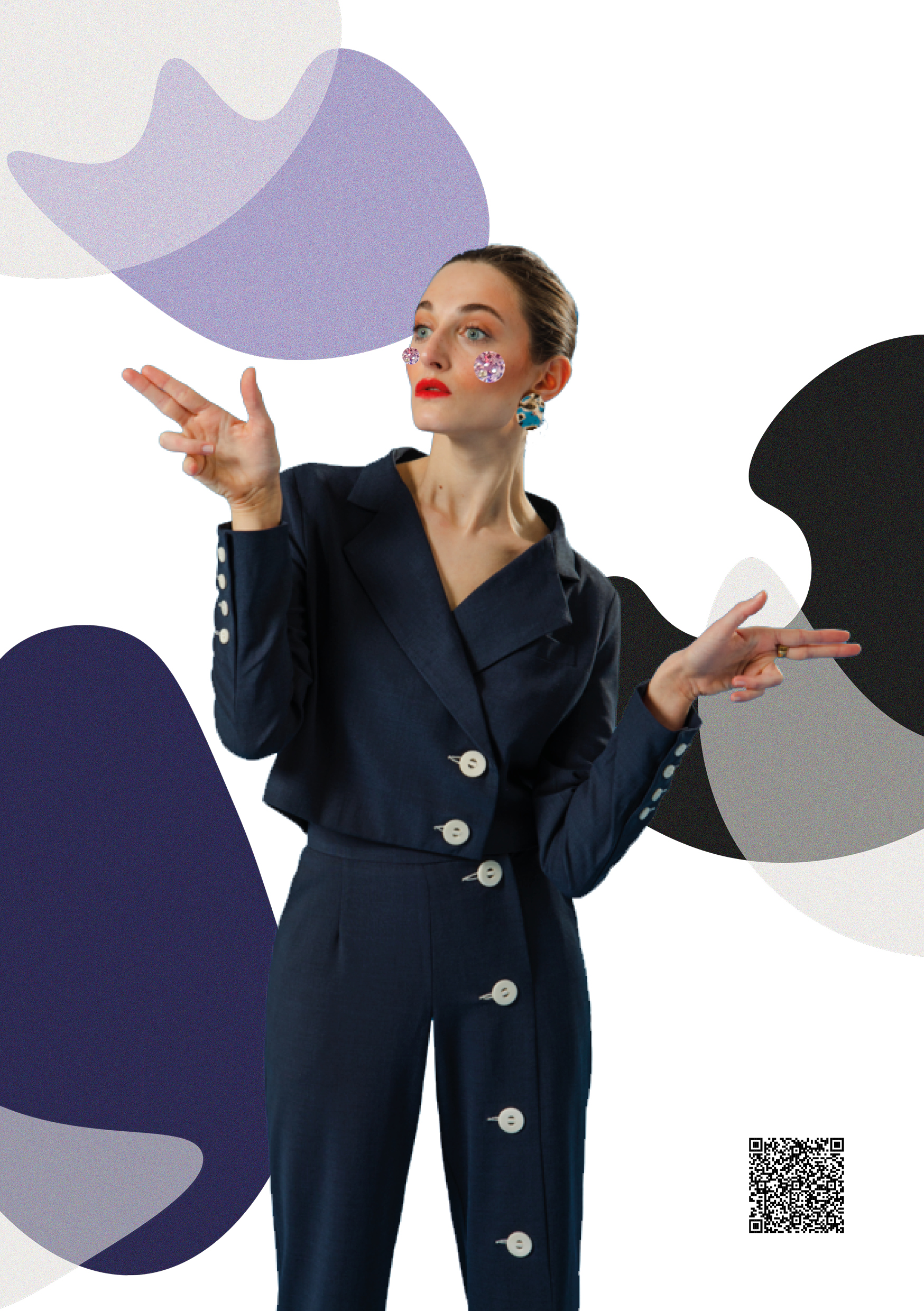
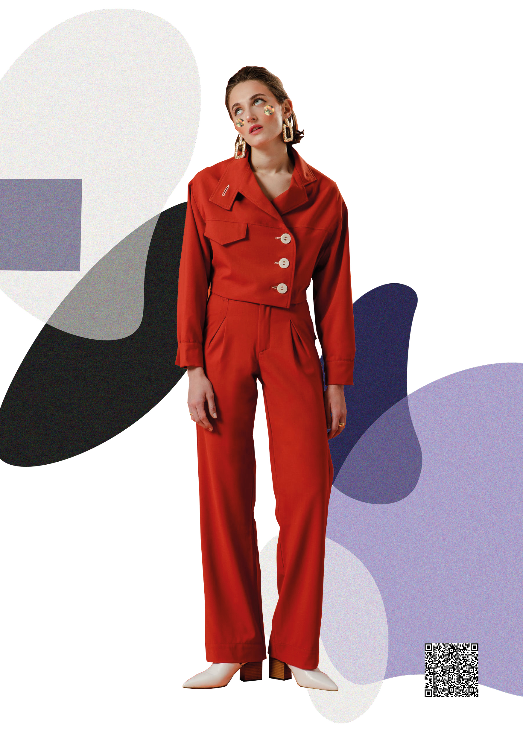
MILA - Cosmetic branding
End of study project : 2020-2021


Rebranding - Le Nouveau Maillon
School project : 2020
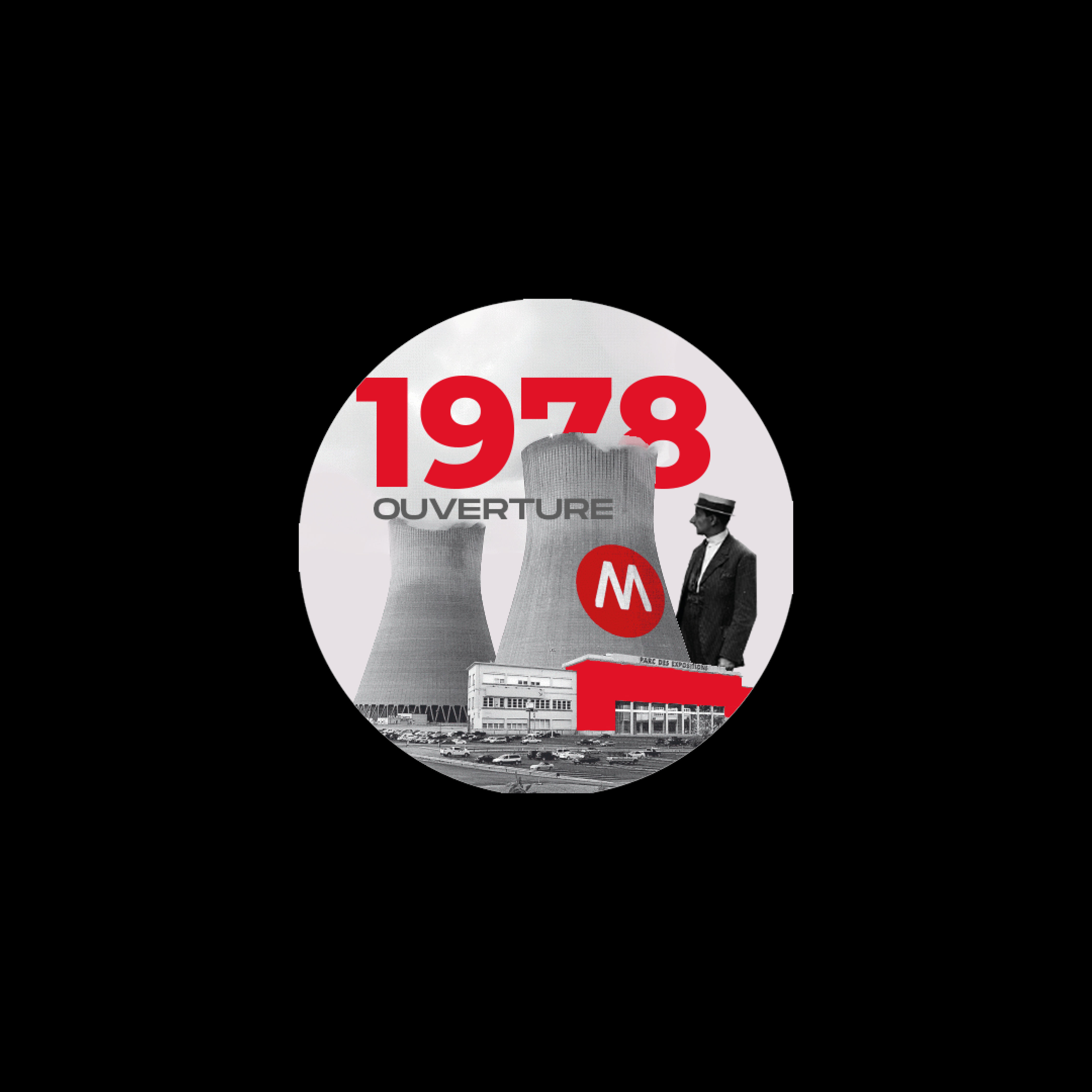
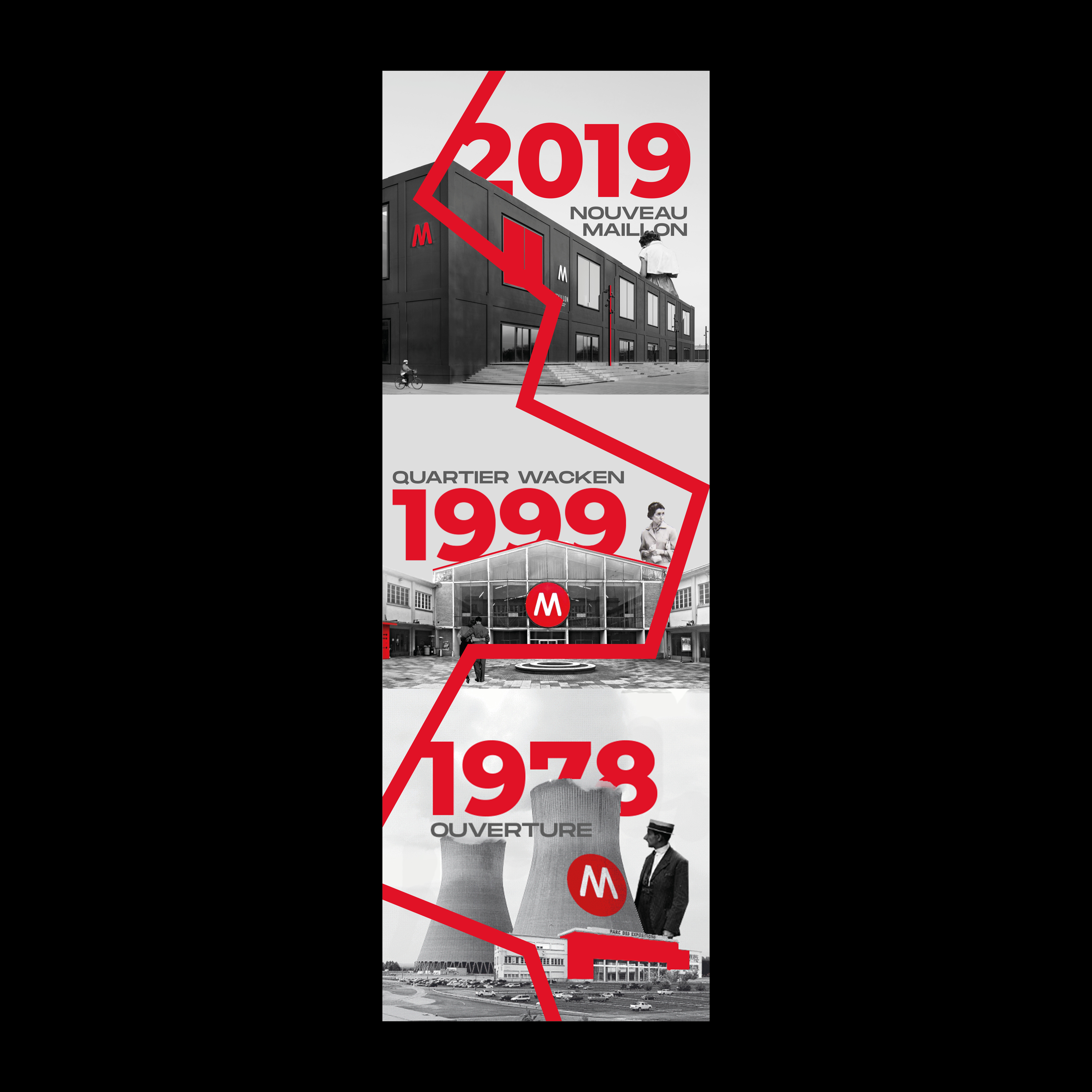
Le Nouveau Maillon theatre in Strasbourg has a rich history marked by three key relocations, each shaping its evolving identity. Founded in 1978, the theatre began in a repurposed industrial space in Cronenbourg, reflecting its avant-garde spirit and commitment to experimental performances.
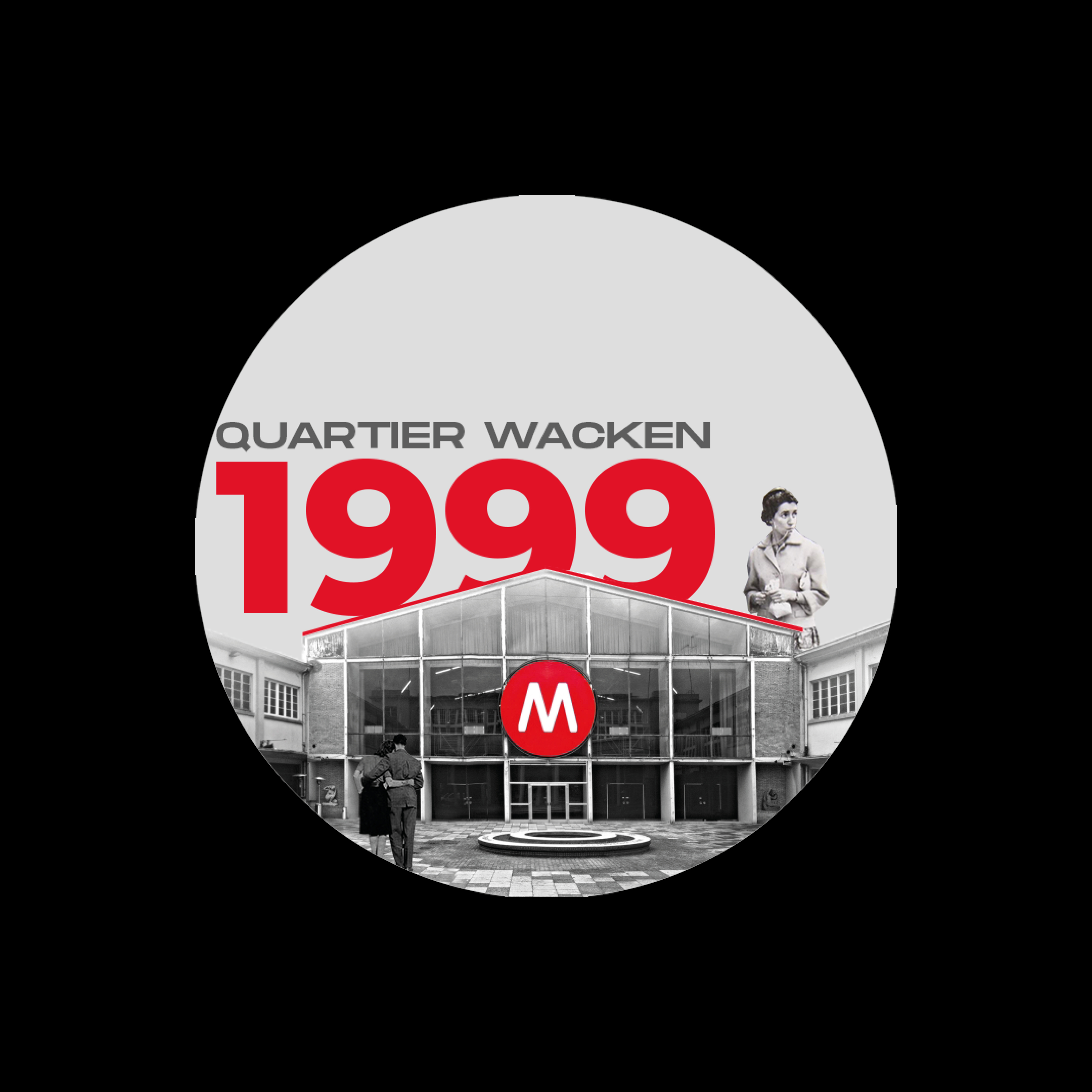
In 1999, Maillon moved to a larger, modern venue in the Wacken district, enabling it to host more ambitious productions and gaining recognition as a hub for contemporary European theatre.
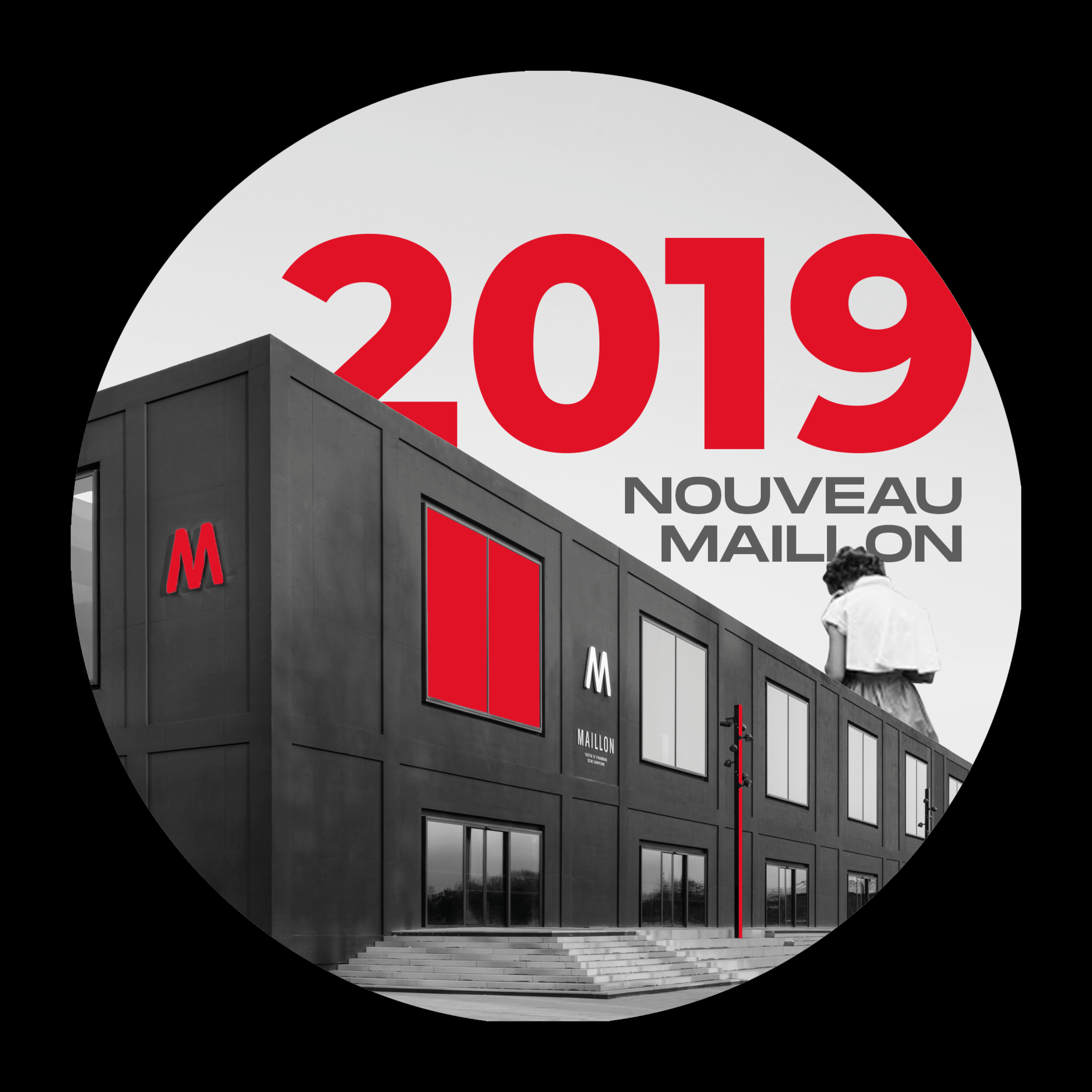
Finally, in 2019, the theatre settled into its purpose-built home in the Étoile district, providing a permanent space with cutting-edge facilities.
These three moves represent phases of growth, from an experimental startup to an internationally respected cultural institution. Le Maillon's changing locations are integral to its identity, symbolizing its journey of adaptation, expansion, and artistic innovation.
In 1999, Maillon moved to a larger, modern venue in the Wacken district, enabling it to host more ambitious productions and gaining recognition as a hub for contemporary European theatre.
Finally, in 2019, the theatre settled into its purpose-built home in the Étoile district, providing a permanent space with cutting-edge facilities.
These three moves represent phases of growth, from an experimental startup to an internationally respected cultural institution. Le Maillon's changing locations are integral to its identity, symbolizing its journey of adaptation, expansion, and artistic innovation.
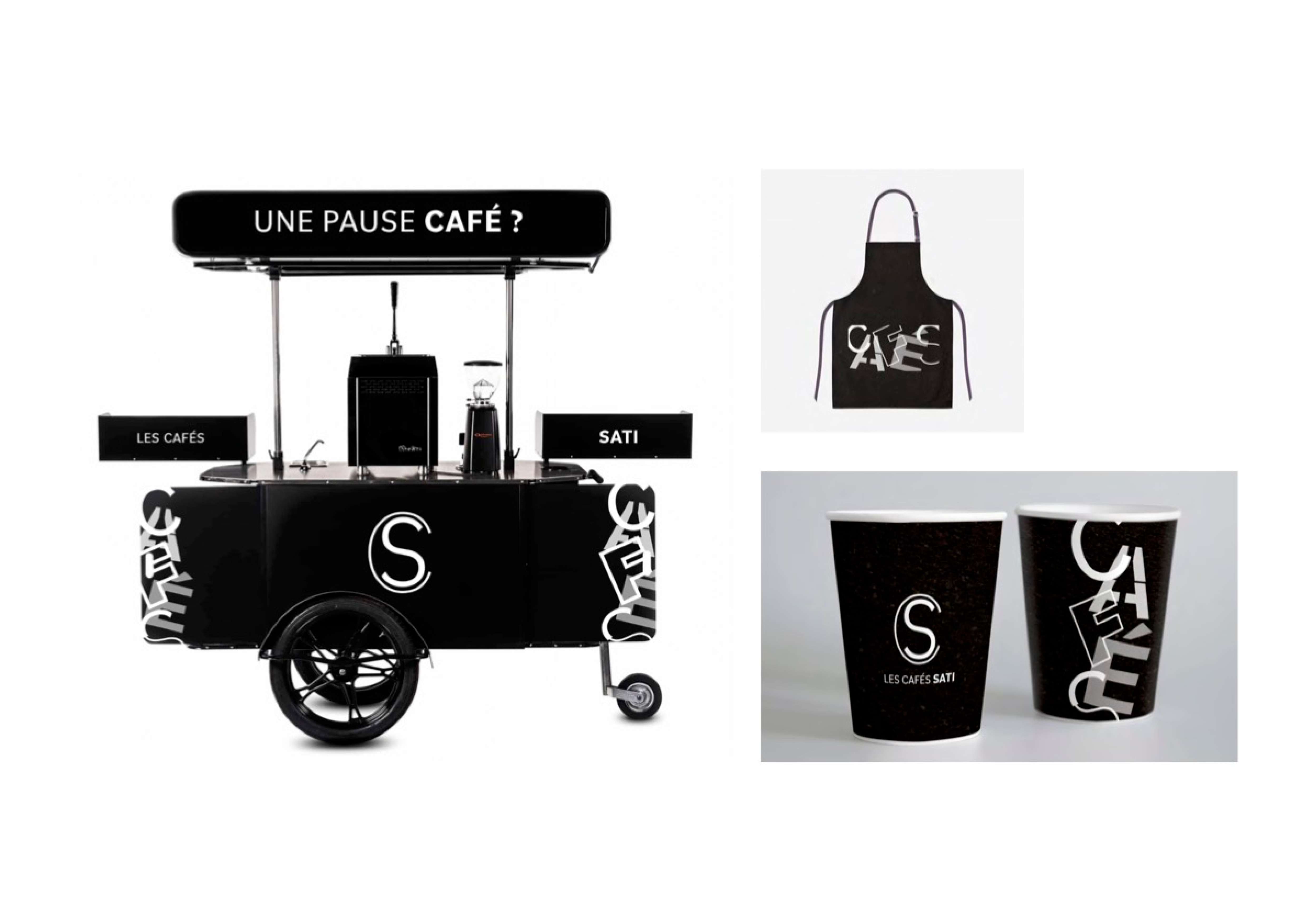
Les Cafés Sati - Coffee Brand
School project : 2019

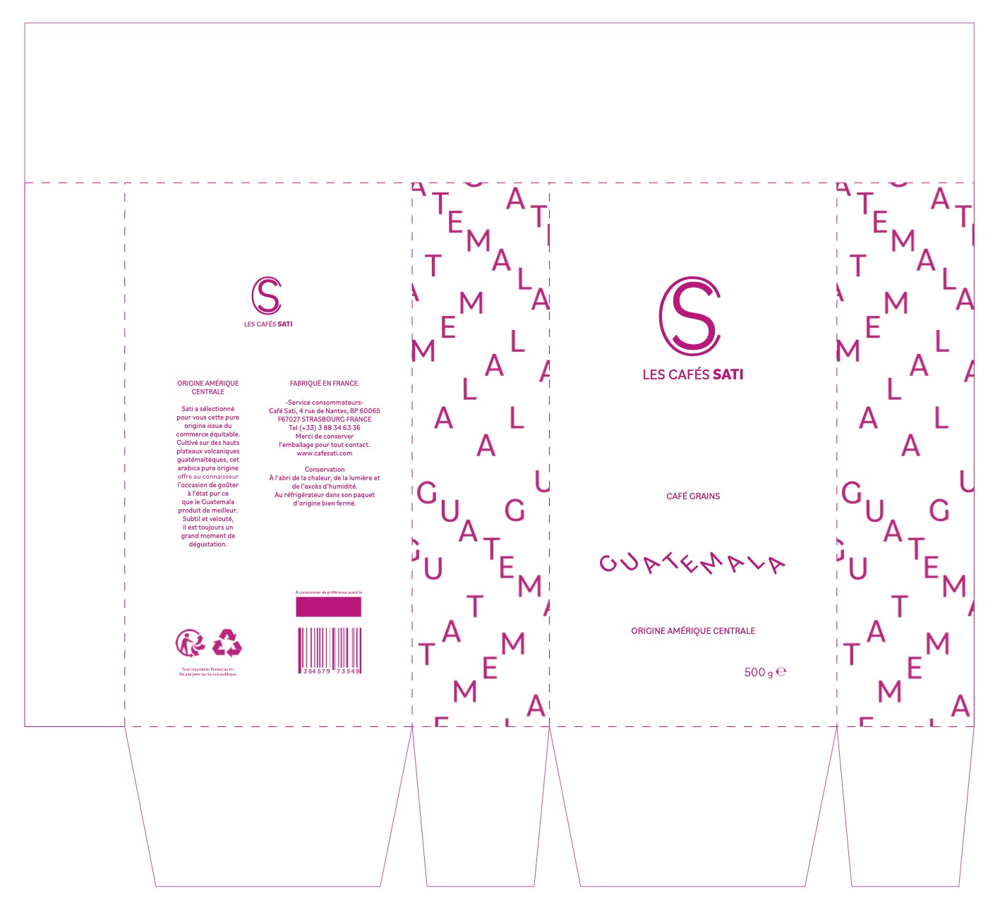

In a fictive group project with Caroline Bender, Andréa Schikowski, Lisa Bernold, and Joanna Aswad, we reimagined the visual identity of the coffee brand Sati.
Founded in Strasbourg in 1926, Sati values tradition.
Our concept, "Return to the Essential," reflects Sati’s pride in its products, avoiding superficial elements.
We focused on typography using the Bilo font for clarity, balance, and adaptability across products.
By using only black and white, we emphasized minimalism and modernized Sati's brand image.